Minimalist iPhone Home Screen
A few days ago, I rediscovered Rands in Repose, thanks to a mention from Chris Bowler that I saw last week. After browsing around on Rands’ site, I was inspired by an article where he shared pictures of iPhone home screens that some of his followers had posted on Twitter.
Time For A Change
Based on the inspiration I found, I decided to overhaul my home screen this past weekend. For the last five months, my iPhone 7 Plus home screen has been on the minimalistic side, with four icons across the top (Calendar, Maps, Castro, and Music). On the second page of my screen, I kept most of my other apps, handily organized into groups by type (e.g. Cloud Services, Reading, Health, etc).1
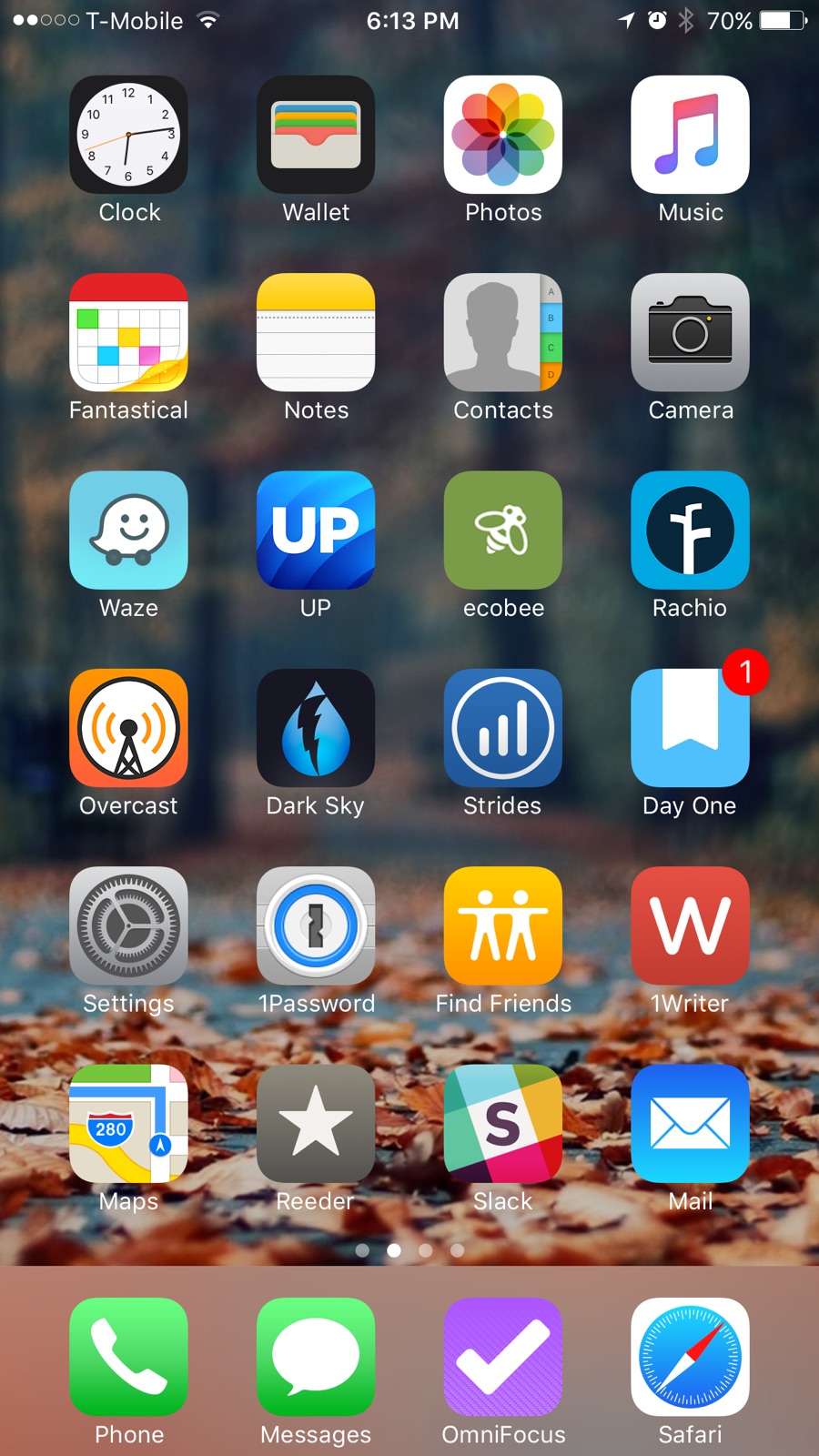
On my old setup, the minimalism wasn’t working as well as I wanted it to. The organized second screen full of folders kept calling to me, so I got into the habit of swiping along to the next screen and digging through the folders for an app I most habitually looked to for “updates”. Usually this was the only app on my phone that has a feed, Photos (thanks to family Photo Streams).
Focused on Input
So this time around, I decided to try something I saw a few folks doing on Rands’ Twitter feed: move all their apps into a single folder, except maybe one or two essentials, then hide that folder away, and use search to get at the stuff that mattered.
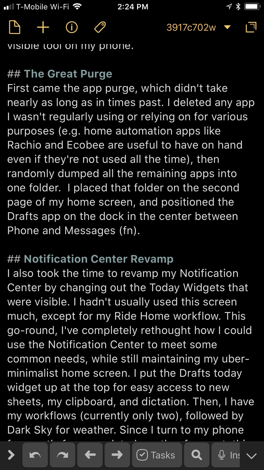
I took this approach a step further by setting the “focus” for my phone to be the creation of content. It should be easiest to accept text-based input and then “funnel” that content elsewhere to other apps, primarily using Drafts as an intake point.2 Because Drafts can use customized actions to move text and content pretty much anywhere, I’ve decided to make it the most visible tool on my phone.
The Great Purge
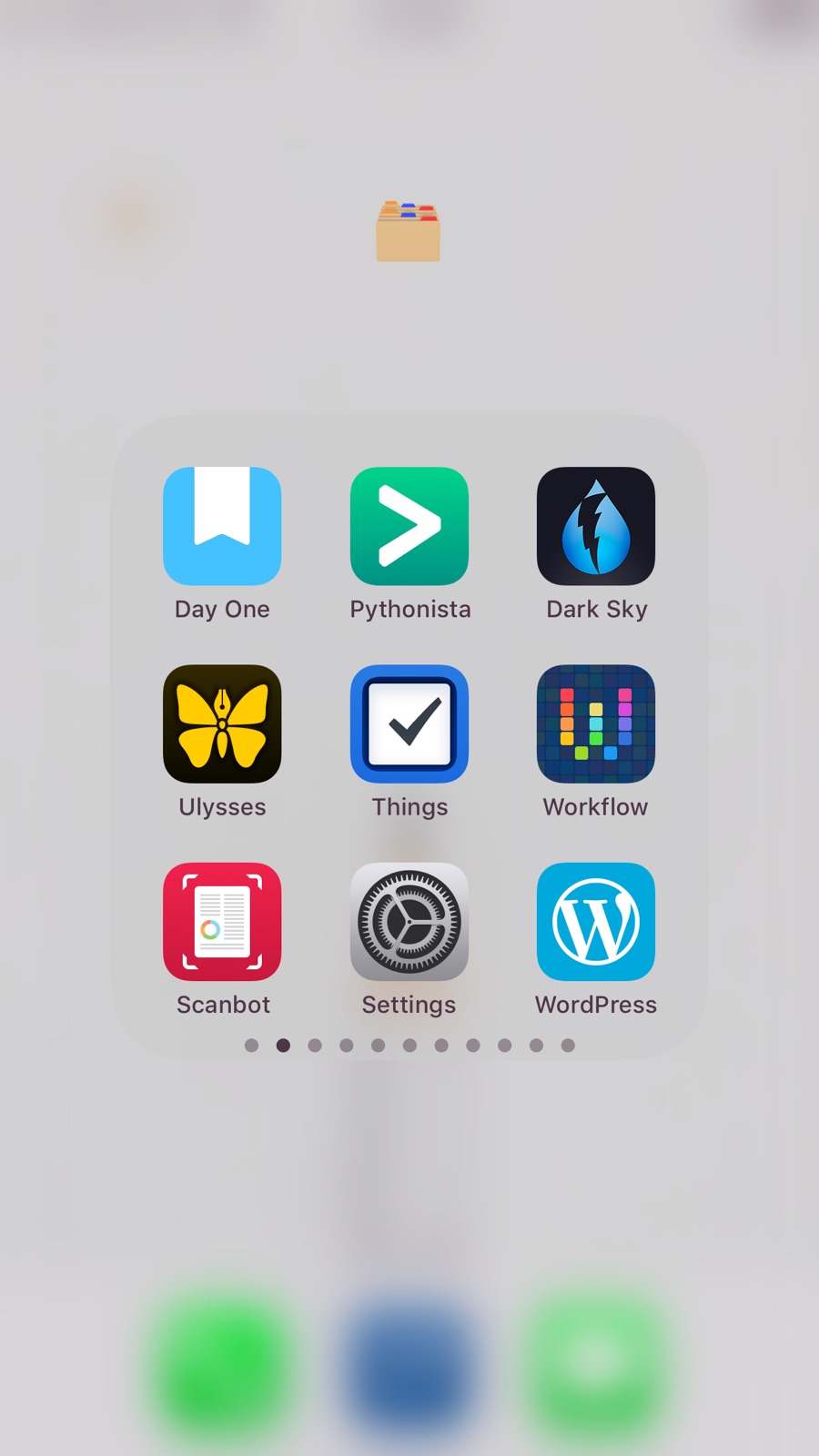
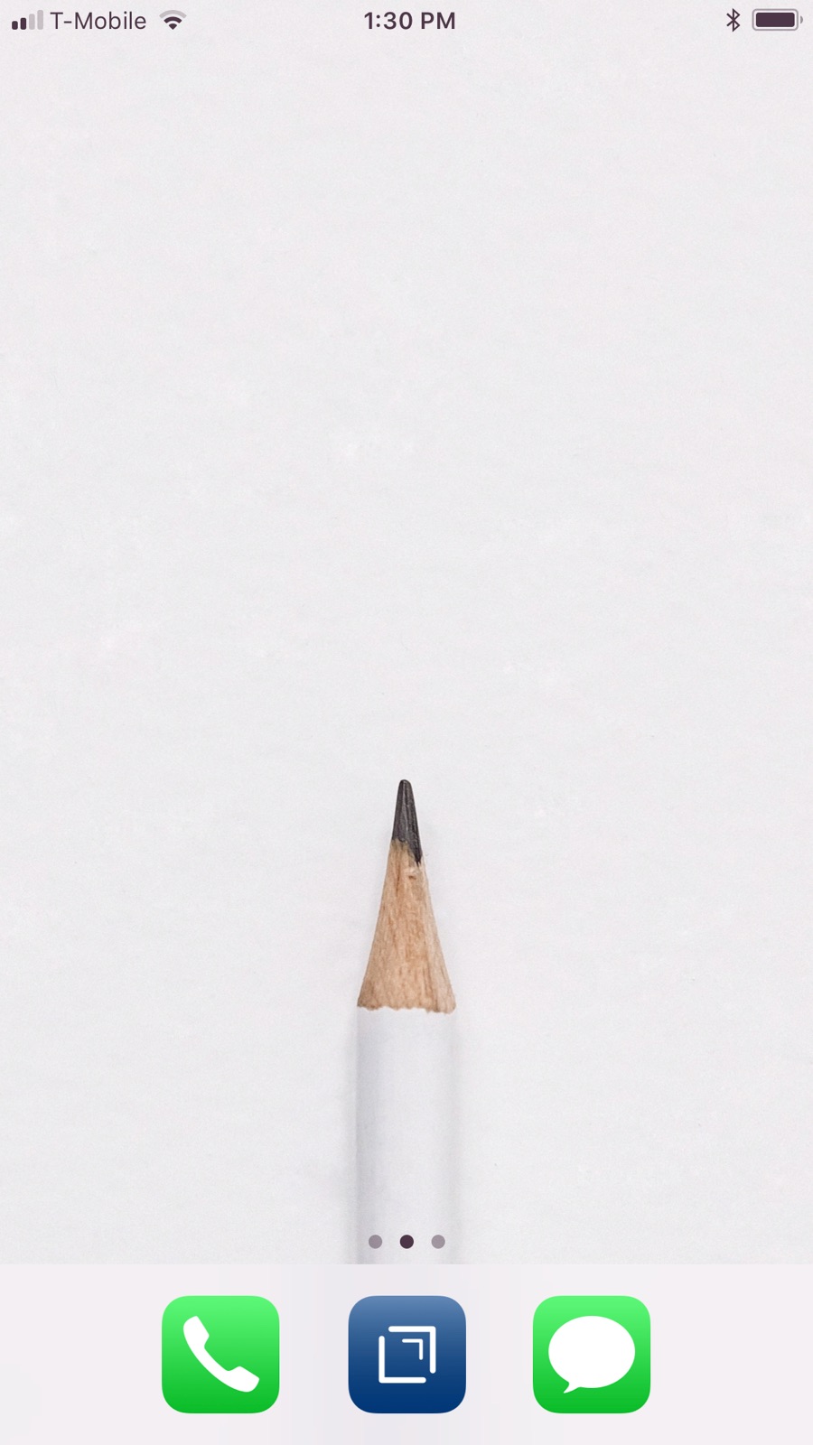
First came the app purge, which didn’t take nearly as long as in times past. I deleted any app I wasn’t regularly using or relying on for various purposes (e.g. home automation apps like Rachio and Ecobee are useful to have on hand even if they’re not used all the time), then randomly dumped all the remaining apps into one folder. I placed that folder on the second page of my home screen, and positioned the Drafts app on the dock in the center between Phone and Messages.3
Notification Center Revamp
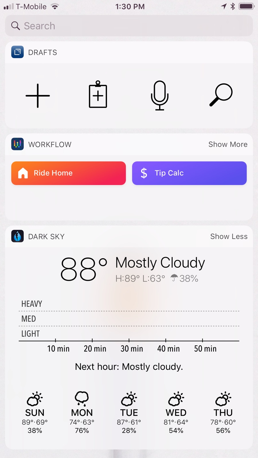
I also took the time to revamp my Notification Center by changing out the Today Widgets that were visible. I hadn’t usually used this screen much, except for my Ride Home workflow. This go-round, I’ve completely rethought how I could use the Notification Center to meet some common needs, while still maintaining my uber-minimalist home screen. I put the Drafts today widget up at the top for easy access to new sheets, my clipboard, and dictation. Then, I have my workflows (currently only two), followed by Dark Sky for weather. Since I turn to my phone frequently for an updated weather forecast, this will be my new place to get that quick update.
Minimalist Wallpaper
With this done, I turned to Unsplash4 for some wallpaper inspiration and came across this very nice image by Yoann Siloine as a minimalist statement: the phone is a blank slate. There’s not much to see here, which should discourage browsing and mindless wandering. However, the Drafts-centric setup is sort of embodied in the image of the pencil; when there’s something to create, and the phone might be the right tool.
Final Thoughts
I’m super thrilled with the new setup and since making the change, have picked up my phone a handful of times, only to be reminded that it’s there as a tool (sorta like that pencil showing on the screen), not as a toy. I’m certain there will be times when I decide to do the “toy” thing and I’ll download a game, but my default will be “tool”. Additionally, the blank screen and catch-all folder really does force me into search mode to find that app I need. So far so good… I’ll probably do an update in a few months’ time to see how well this plan is working.
-
Unfortunately, I didn’t take “before” pictures, and I’m not crazy enough to try and reset my phone to its old state just to show the internets a “before and after”. ↩︎
-
I’m currently typing this article up in Drafts, using my iPhone connected to a Bluetooth keyboard. ↩︎
-
I consider Phone and Messages to be the primary apps for my smartphone; if I can text and make phone calls, it’s still a phone. Someday I might go to a dumbphone, but it will still support phone calls and texting. ↩︎
-
By the way, the Unsplash iPhone app is super nice and makes it really easy to download and search for photos. ↩︎