Automation: Pythonista, Reports, and Graphs

I had a bit of free time this evening and tried my hand at reporting on iOS using Pythonista. I had heard from various blog posts about the idea of using a Python script to massage and process data in a way that would be easier than the lower-code options of Siri Shortcuts or other automation tools. My main purpose behind this was to get a better view of data that affects one of my hobbies, coffee roasting.
Coffee Meets Coding
I focused my efforts on migrating a workflow I had built earlier on iOS to query my budgeting software, YNAB, in order to look up income from a specific category. I wanted to move this automation to code: in this case, a Python script that could be run in Pythonista. The original use of the workflow was to calculate the total income/donations I had received from friends and colleagues towards coffee roasting costs. This data helps me gauge when I’ll be able to purchase the next bag of coffee from La Bodega, recognize whether I’m bringing in enough to cover the costs, etc.
Code Example
Below is a segment of my code for the script. I’m using urllib3 to call the YNAB API, json to parse the results, and matplotlib for generating the graph. I stole some of this code from an older MacStories article on the topic.
import urllib3
import json
import datetime
import matplotlib.pyplot as plt
import numpy as np

# ...

budget_id = get_budget_id(budget_name)
category_id = get_category_id(budget_id, category_name)
api_txns = get_transactions(budget_id, category_id, month_start)
year_list = get_years(api_txns)

months = []
totals = []

for y in year_list:
	month_no = 1
	while month_no <= 12:
		month_date = datetime.date(y, month_no, 1)
		total = get_month_total(api_txns, y, month_no)
		totals.append(total)
		months.append("{month} {year}".format(month=month_date.strftime("%B"), year=y))
		month_no += 1

x = len(months)
x = range(x)
plt.plot()
plt.plot(x, totals)
plt.xticks(np.arange(min(x), max(x)+1, 6.0), months[::6], rotation=40, size='xx-small')
plt.show()
The result of this is a graph that looks something similar to the image below:
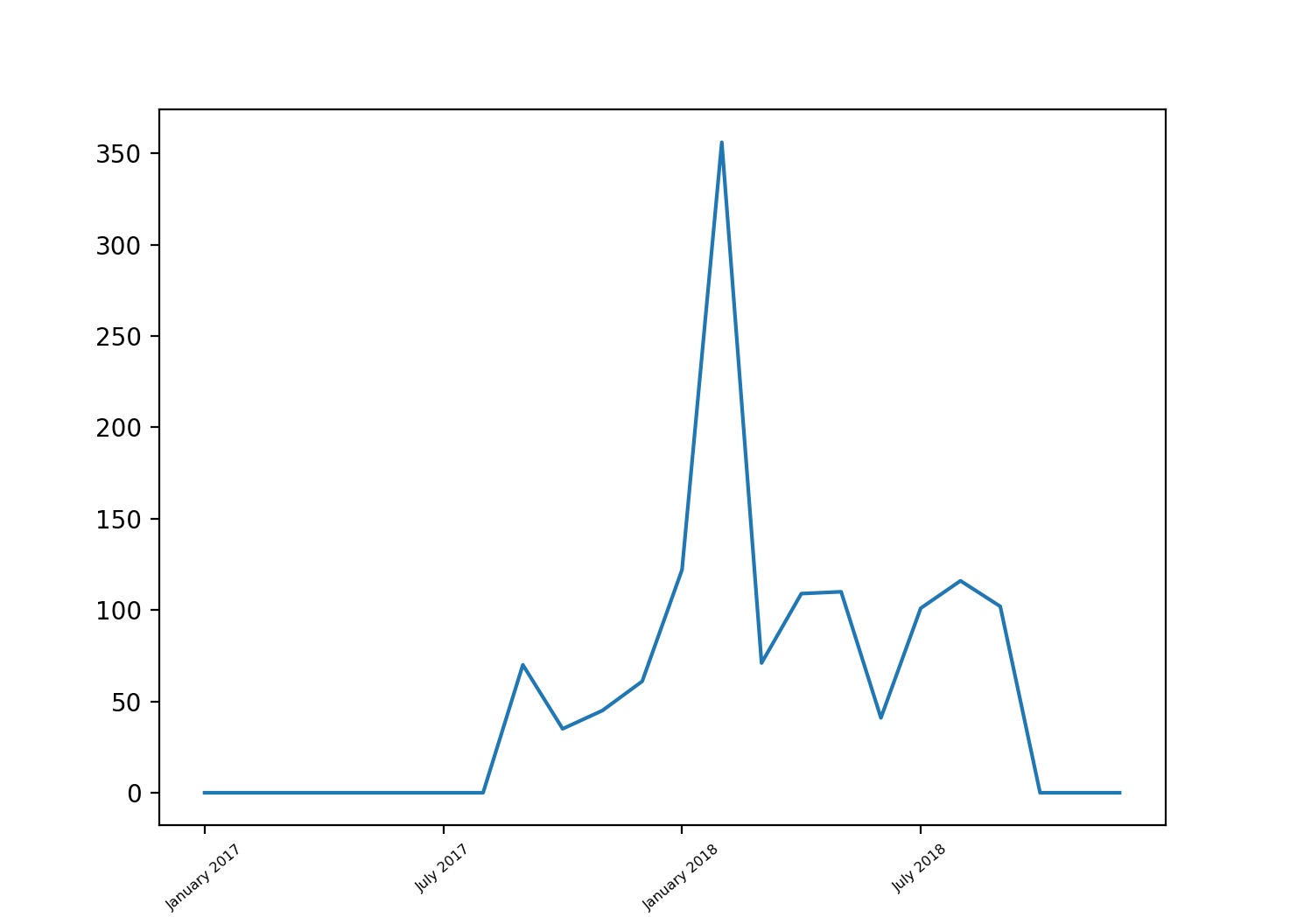
The spike in the graph occurred right around the time when a number of my colleagues all went together and donated money to purchase an espresso machine for the office, but then the company agreed to cover the entire cost, prompting many of my coworkers to offer their contributions as coffee-roasting donations. As you can tell from the graph, the usual average income is commonly around the $100 mark each month, which is close enough to cover the regular costs.
Next Steps
My next plan with this is to integrate it as a Drafts action (or something similar) so that I can query the data on the fly for specific months. Now if I could only get Aillio to publish an API from their software so I could compare my financial numbers against actual roasting data…